 Many business owners imagine that color variation in their digital and print campaigns don’t carry as much weight as the actual service or product quality. It’s just color. Right?
Wrong. Your branding colors are the cornerstone of success when it comes to recognition and your company’s associated reputation.
Don’t Dilute Your Brand with Color Variation
Consistency is king for holding a competitive edge and speaking at any length to your market. Maintain a visual language that’s consistent across platforms and media in color and style.
People will remember your brand and are more likely to associate the message and feel you want with your company and its products. Your brain processes an image 60,000 times more quickly than text.
What’s the purpose of your logo? It’s to build recognition via repetition. Let’s face it: humans are inundated by tons of information daily. The brain processes 400 billion bits of information daily, and humans are only aware of 2,000 bits.
Being unique, authentic, and consistent are the ways to your consumers’ hearts and pockets. Diluting your logo and other brand materials with color variation tires and confuses the consumer.Continue Reading..
 Any marketing professional worth their salt will tell you that color is vital to your brand’s success. The colors you use in your branding and advertising make a huge difference. The psychology of color is a big topic. We will focus on how and why different colors appeal to specific demographics. Here is what you need to know.Continue Reading..
 Brands face incredible challenges when it comes to building recognition in today’s broad global market. One wrong move can hurt sales. With so many people vying for attention online, in print, and every other advertising medium, you have to put in the extra effort to get your name out there. More challenging still is figuring out how to retain those customers after you’ve got their business. Here’s what you need to know about the importance of color consistency in branding and why any variation can decrease your sales.
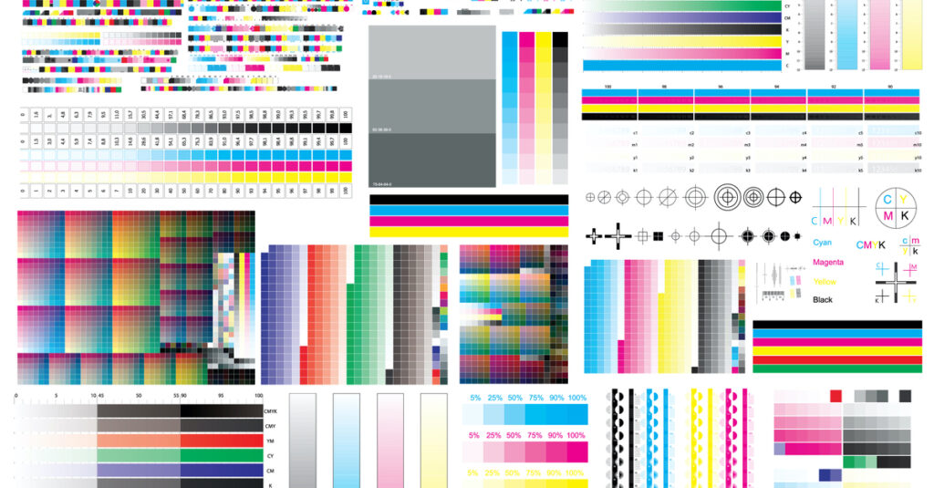 For businesses today, print quality is of utmost importance. Branding has become essential, and one of the most vital components of branding is color. Your brand colors go on all sorts of printed material. You use much of this material, either directly or indirectly, to advertise your business. Here’s what you should know about MeasureColor and how your business can benefit from it.
 With so many brands on the market, grabbing attention is harder than ever before. Domestic companies are going against each other. They’re also going against the constantly encroaching brands from afar as the global market continues to grow.
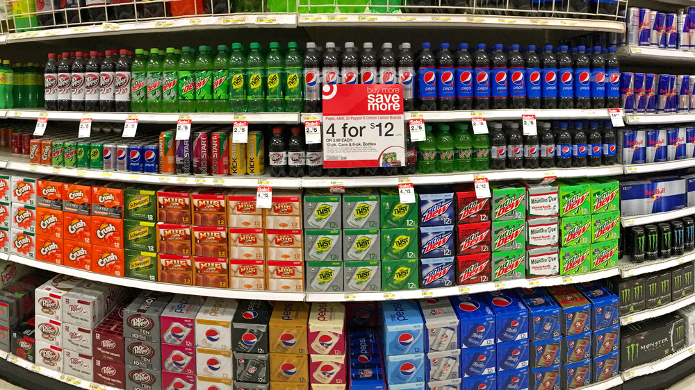 Stand out colors matter in business. Let’s face it; color is an incredibly important part of your marketing mix, particularly your packaging. It is undeniably essential in both print and digital form. Color grabs attention, at least that’s what it’s supposed to do.
 When you consider color quality, you are often concerned about the final product after it comes off the press. Indeed, many factors affect color in printing, from a poorly calibrated monitor to selecting the wrong color mode on your computer while designing.
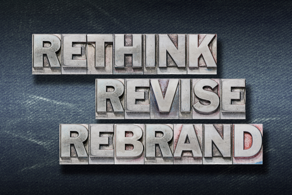 Building your brand is a major undertaking that comes with high stakes. When you get your branding wrong the first time, especially as a startup, your failure to resonate with your audience poses risks for your business. When you rebrand as an established business, rebranding still risks losing part of your customer base if you don’t get it right.
 In a dream world, all colors match. Color matching is easy as the ink gets added in the press, and the job is run without any complications in mere seconds. Yes, that’s the dream. Right there.
 So, how do you select the right color combinations for your brand? For your logo to your latest marketing campaign. You want to stand out from the competition. And appeal to your target audience.