 When you consider color quality, you are often concerned about the final product after it comes off the press. Indeed, many factors affect color in printing, from a poorly calibrated monitor to selecting the wrong color mode on your computer while designing.
Color quality also matters when it comes to lighting conditions whether you’re shooting photos of a product or observing the final product. The eye takes in color differently at night vs. day and also beneath various indoor light conditions and natural light.
The Science of Eyesight and Color
The color you notice depends on the amalgamation of light frequencies your eye receives. This mixture depends on the frequencies that the object you’re looking at takes in as well as the frequencies that make up the original light source.
If the surface observed doesn’t absorb color, then all colors are reflected, and you perceive white. If the surface absorbs all red, then it will reflect blue and green, and you will see the color cyan. Do those colors sound familiar?
That’s because they are used in printing and taken factor into digital design. CMYK (cyan, magenta, yellow, and black) are used for print, and RGB (red, green and blue) are used for digital.
In the science of eyesight, red, green, and blue refer to three larger potions of what the eye can see or the visible spectrum. These portions are termed by the three types of cones that exist within the human eye and are named for the wavelengths they absorb the best. These cones don’t sense a particular frequency but rather a broad range of the spectrum. How does that affect lighting?
Daylight and Color Quality
Daylight is diverse in its variation as a light source. It ranges in intensity and temperature from sunrise to midday to sunset and beyond. Midday sun creates hard shadows, whereas sunsets extend shadows.
When designing materials for outdoor usage, know that color quality will appear different than it does on your screen under incandescent or fluorescent bulbs.
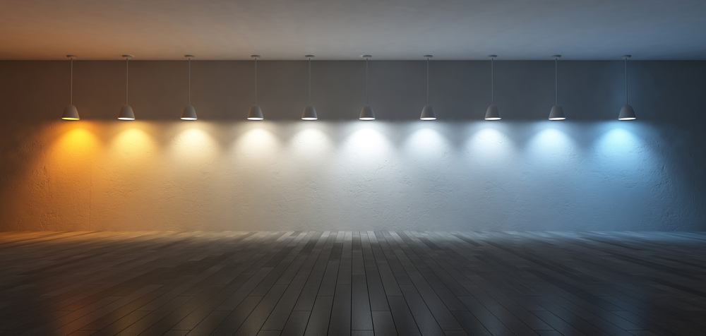
Incandescent Light vs. Fluorescent Light
Before frequencies of light may be reflected, they first exist within the light source. If you begin with an incandescent bulb that appears “yellow” to the eye; then, you begin with a higher degree of photons in the green and red gamut than that of the blue gamut.
That’s how you perceive incandescent lights as yellowish. It’s why this type of bulb emphasizes warmer colors in surfaces and objects. There are more green and red on hand inside the light itself to jump around the room and into your eyes.
With a fluorescent bulb, there’s a higher portion of blue in the light to dance off the object. The larger percentage of blue brings out the colors in objects where the light is bouncing.
You can’t predict what bulbs people use, but you can account for lighting in your design environment. Indoor lighting and your monitor will affect your eyes, so work according to this knowledge. Calibrate your monitor, choose the right color mode, and rest your eyes. Also, it’s good to be aware of where the final product will be viewed or experienced, within reason. Outdoor or indoor?
Interestingly, incandescent light flatters people more than fluorescent light with its blue tones. The face appears more radiant beneath warm tones. This also applies to products, such as produce, so many grocery stores avoid lighting their vegetables and fruit with fluorescents.
When the light source changes, so do the color. Surfaces and objects have a whole different color in the daylight than underneath incandescent or fluorescent lighting. The time of day also affects color quality and perception. Objects that match when in certain lighting conditions will not match in others, known as metamerism.