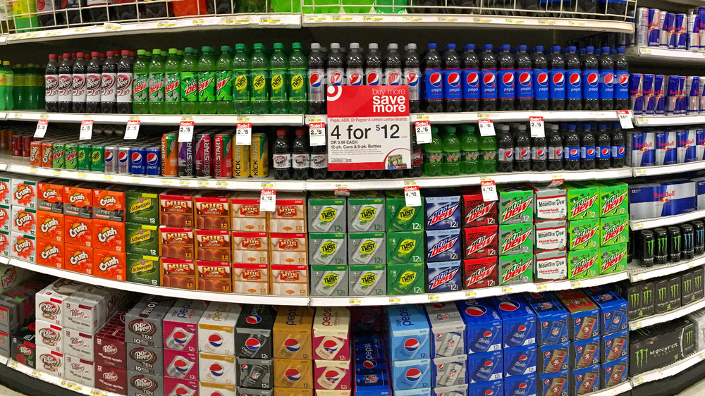
 Stand out colors matter in business. Let’s face it; color is an incredibly important part of your marketing mix, particularly your packaging. It is undeniably essential in both print and digital form. Color grabs attention, at least that’s what it’s supposed to do.
However, to really hit home, the color on your packaging and printed materials need to do more than grab attention, they need to stand out.
Stand out Colors & the Challenges of Color Proofing
One of the most common and frustrating problems that businesses have is when the color on what you’re printing doesn’t match what was shown on the proof. Not only can this be expensive, but it can also be damaging to your sales if you let products go to market marred by imperfections in color.
The challenges of getting the right colors that you’ve been expecting from the proof extend beyond print and into digital media as well. The same challenges make it difficult to get the color right in digital formats as well.
The rule of thumb is that the more you want the color to match, the more reflective it is. One of the primary debates on these challenges is focused on this question whether the abilities of the proof should be built to match the press or vice versa.
One of the most promising solutions for digital media involves matching analog proofing systems. More generally, however, SWOP proofing is still one of the biggest drivers of color consistency.
The key to creating stand out colors is to partner with a printer that knows proofing in and out. With their help and guidance, you can focus on running your business without stressing over color consistency.
What Not to Do: Blend in
When it comes to products on the shelf, the last thing you want to do is blend in with everything else. And this is more difficult than it may seem. Everyone is trying to create stand out colors.
You need your products to stand out, grab attention, and make a sale. That means that the color of your packaging needs to pop, and it needs to rock. You don’t need to be loud or flashy. Be precise, even when using bold, attention-grabbing colors like red and yellow. You still need to find the right shade of those colors, and that takes precision.
When thinking about the importance of having the right colors to associate with your brand, try this exercise. Think of major brands like Harley Davidson, Coca-Cola, Amazon, etc. Now think of the colors they use in their logos and how distinctive they are. Orange and black will forever be strongly associated with Harley Davidson. The very thought of these colors brings the company to mind just as the color red evokes thoughts of Coke. You should be striving to achieve the same level of familiarity by having your brand be the first thought that comes to mind when thinking of its primary colors.
In conclusion, you want your packaging and printed material to stand out while also becoming familiar to customers who have come to recognize and associate your products based on their colors readily.
Keeping Color Consistent
Consistency in terms of color is every bit as important as stand out colors. After investing so much time, energy, and capital into developing a set of colors that suits your brand and target market. Keeping it the same is the next challenge. Any major variation in color after you’ve established ones that customers have come to expect from you will harm sales. Consistency in color is just as important as consistency in customer service.
