 In a dream world, all colors match. Color matching is easy as the ink gets added in the press, and the job is run without any complications in mere seconds. Yes, that’s the dream. Right there.
Technological advancement has made it easier for printers to help their customers achieve color accuracy. However, many variables affect color and ink and time waste, trying to get the colors right.
Achieving color accuracy goes beyond adjustments on press and starts at your desk. Here are a few steps you can take to make sure your colors match when the job is run.
Color Matching: Working in the Correct Color Space
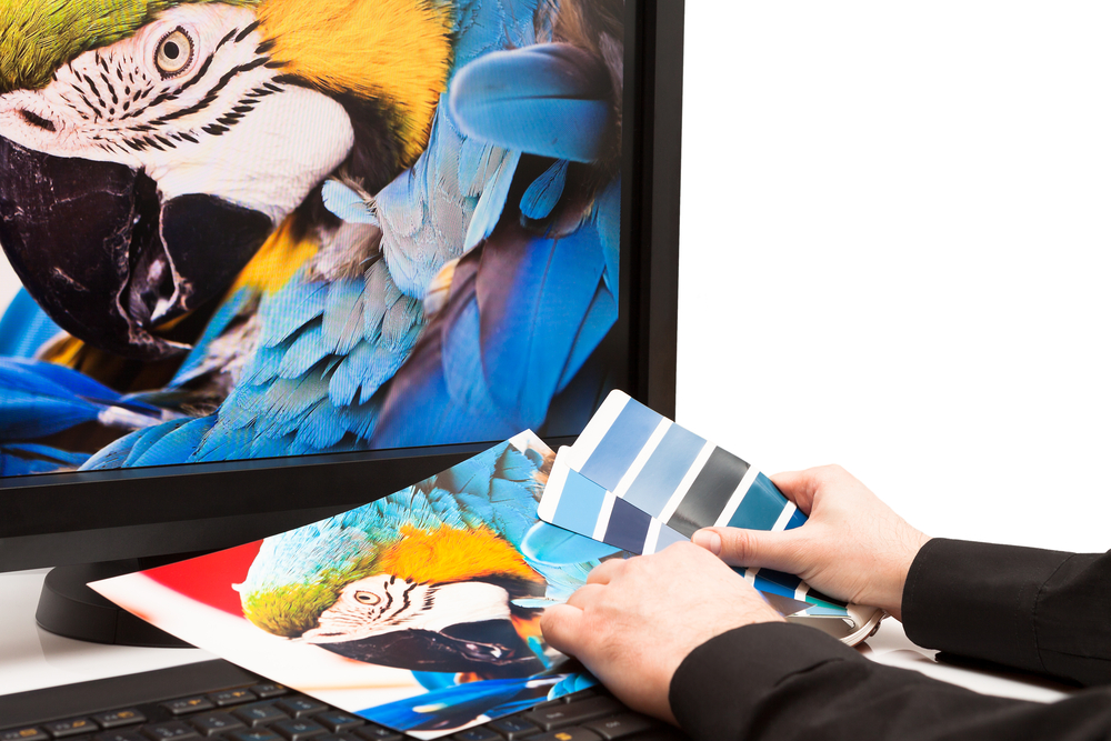
You might notice various color spaces on your laptop or desktop. By default, nearly every computer uses sRGB, and Adobe apps will utilize the Adobe RGB color space. You will also have the option to use CMYK. Working in the right color space will save you a major headache.
RGB refers to the primary colors in monitors, which are Red, Green, and Blue. CMYK refers to Cyan, Magenta, Yellow, and Black, which are the inks we use in 4/color process printing, also known as full or four-color printing. The blend of RGB light generates white, and the mixture of CMYK inks generates black. So, the printing press will never exactly recreate what’s on your monitor, but it can look darn close.
Many programs allow you to convert from the RGB color space to the CMYK color space for color matching. When you adjust colors yourself, you have greater control over the final result. You may see a shift in the conversion you don’t feel is accurate.
Sometimes, a good workaround is to lighten the color builds a little as the dots of ink “fatten” on press, and present more pigment on the page than on the monitor. Pantone’s color library system offers a universal solution to achieve accurate color reproduction. It’s an investment, but you can provide your printer the Pantone (PMS) number.
Don’t forget to calibrate your monitor, as it may be brighter or darker than it should be.
Light backgrounds also help text to remain legible and accurate to the eye. The way you juxtapose colors next to each other affects how the eye perceives them.
Color Matching: Paper Choice Affects Color Issues
You can blame the machine for color matching issues, whether that’s the press, the monitor, or the app you’re designing on. However, many people overlook the paper itself. Even if the printer and monitor are calibrated, poor paper or wrong paper will throw your colors off. Again, it comes down to how the eye perceives color.
So, you will need to think about how your logo appears on a matte vs. glossy paper. Following the right color space, calibrating your apps and devices, and choosing the right paper lead to less disappointment.
Final Tips: Provide Samples to Your Printer
Trying to reprint something from a previous press run? Want to match another piece of collateral?
Work with your printer in advance and always provide a sample of the prior work so that they can color match on their end. Many printers prefer a “palette” of base colors due to experience and will do their best, but that best will be more accurate with samples. Samples assist with accuracy more when you are doing a large run or a complicated job.
Color matching goes beyond press adjustments. After choosing the colors in your design, you may run into issues with getting what’s on the screen to match what’s on paper. When it doesn’t turn out, it feels frustrating and confusing to troubleshoot the issue.
Reduce the proofing you have to do to achieve color accuracy. Make sure you are working in the right color space. Calibrate your monitor. Look at your color juxtaposition and background choice, as well as the paper quality and color itself.
There you have it! Less worrying about on press adjustments, and more color matching accuracy.