 By now, most people know that the best press-ready materials don’t originate from designs in PowerPoint. However, you may still be left scratching your head when you think you’ve done everything right. But the final products don’t match the proofs. Seriously. And: Why?!
Color matching on all print materials must prove successful to ensure strong brand integrity. You would notice if Coca-Cola switched a shade over from their iconic red. The original red is three different shades and came from a time in the ’90s when the company painted the barrels of Coca-Cola bottles so that tax agents could tell them apart from alcohol during shipping. The color would later inspire the pop artworks of Salvador Dali and Andy Warhol.
So, for over 30 years, every designer that the brand has used always has had to match that iconic color from proofs to final product. Yes, movements and sustainable brands are made by getting one color right. The stakes are high and rightfully so.
Proofs: Why Matching Is a Challenge
Your digital products and printed products use different color modes: red, green and blue for digital (RGB) and cyan, magenta, yellow and black for print (CMYK). All printed materials must be printed in CMYK, and you know that was done. So, why aren’t the products matching the proofs?
Improperly Calibrated Monitor
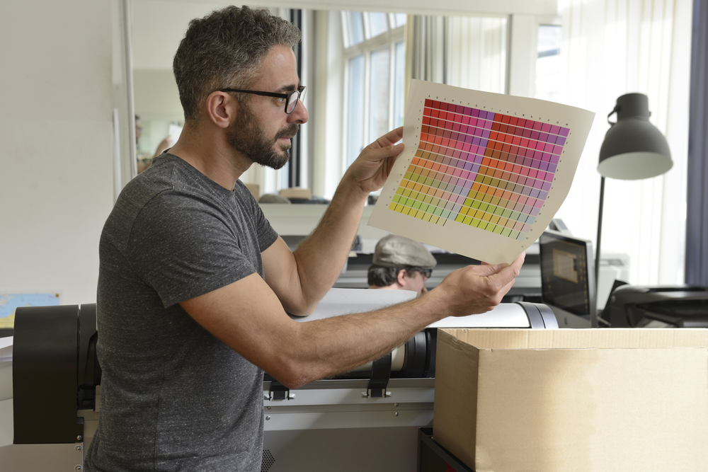
You may notice that your printed products don’t match the digital proof when you’re analyzing them comparatively on your monitor. However, the discrepancy in color matching may be down to an improperly monitor calibration. Most monitors make color pop and don’t reflect your product accurately, leaving you in a panic.
Always contact the device manufacturer to calibrate the monitor correctly. Just because it says “calibrated” on the box doesn’t mean it’s set up to your particular requirements.
Monochromatic Images
Chroma refers to “color,” and mono refers to “one.” Hence, you have a monochromatic image when you have one or more shades of the same color in that image. Sepia tone images are a good example and challenging to print in many processes. The eye quickly picks up the smallest color shifts in monochromatic images. The issue is that this is a difficult one to print from the start, so always insist on proofs, and check; and re-check.
Color Profile Fails on Proofs
You may notice that your computer has different color space profiles. Most computers and mobile devices that access the web utilize sRGB. The installation of Adobe apps introduces AdobeRGB color space with various CMYK color profiles. Always work the appropriate color profile for the right output device.
The Adobe RGB 1998 color space has a gamut that’s larger than sRGB. More color options are vibrant, like coloring with more crayons, but that doesn’t make it better. Some screens can’t display all those colors. Feel free to go with Adobe RGB if editing on a wide gamut screen and working with a printer that handles Adobe RGB.
For the most accurate color reproduction of spot colors, use Pantone’s color library system for a universal solution. While it is an investment, you can provide the exact Pantone (PMS) number.
However, you can also use CMYK reference equivalents without having to add spot colors to supplement your brand color. Various online tools are available to help you find the right CMYK equivalent for your proofs. The type of printing process, whether offset, digital or large format, also matters, so work closely with the printer.
Final Thoughts
Color matching is more critical than ever. Customers expect the same level of quality on all of the print products they buy from the brands they love. But printing presses aren’t perfect. The items we see are some of the common issues you’ll run into as you look to match your proofs to the final products. Use that insight to help with your next printing project.