 Many companies turn to retro branding to bring out nostalgia and a sense of trust. In 2014, Coca-Cola released Coke Life. A new product with less sugar and more natural ingredients. Also with the classic Coke taste — minus one component, its red branding color. Coke Life came in a green to match its natural transition. Needless say, the product was pulled from many shelves over the next few years.
So color is essential to branding. And over time, brands grow and adjust. But they may find themselves revisiting their roots and boosting retro branding.
Retro Branding: What is it?
Think of retro branding as add pep to historical brands with updated features. A product’s branding is based on its history. Over time, history lends itself to an image of being classic, trustworthy and fashionable in a customer’s eyes.
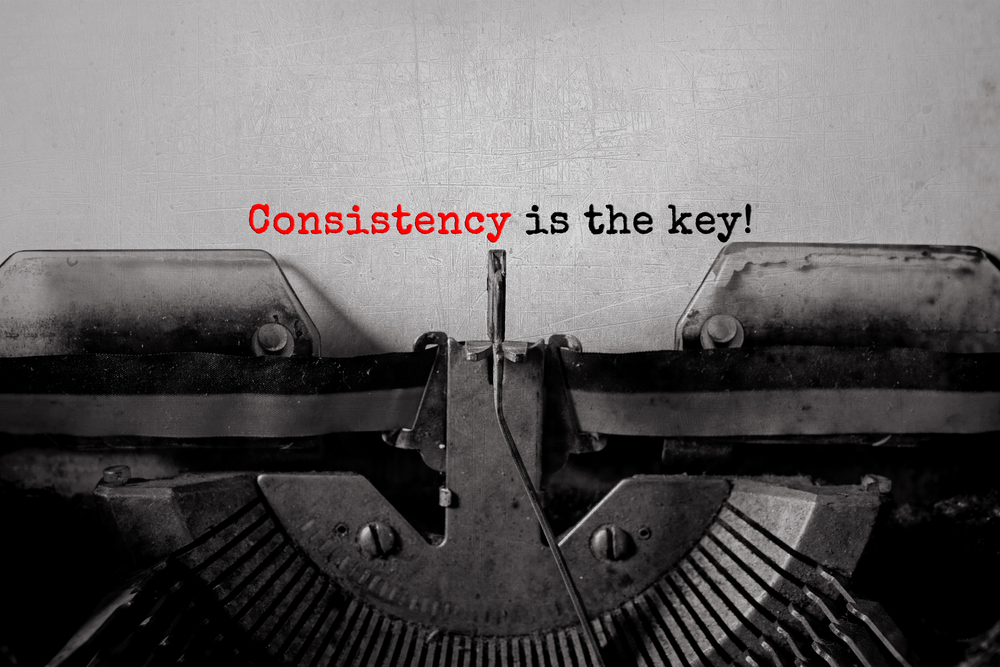
Customers also need to know how to identify your product as time passes. As people are mainly visual creatures, it makes sense that your branding needs to remain consistent over time.
Ray-Ban sunglasses created their aviator sunglasses, inspired by the Vietnam War period. With a few modern embellishments, they continue to have a classic product.
You don’t create anything new with retro branding. You express your history. There are essential features you must focus on when doing a retro branding campaign. They include authenticity, simplicity, and belonging.
Retro brands also have the power to cultivate a sense of craftsmanship with values from a period when the world was safer and less commercialized. Consider the modern needs of the world and its people, your customers. Don’t risk getting overlooked because of inconsistent colors.
How To Get Color Consistency in Retro Branding
Staying true to your colors can equal showing your true colors to customers. How are you pulling from history? Is it through the heritage of a product and its company, or are you creating a whole new history inspired by a period you love?
Also, no matter your starting point, how do you ensure color consistency in retro branding campaigns? Here are five tips to stay true to your retro color choices:
1. Research Colors of the Period
People remember different eras of time for specific colors, patterns and elements. During Renaissance times, blue was often seen as a color of royalty, military, and station. People prized its associated metaphoric “status” due to its rarity from few natural plant sources for dye.
Also, the sixties were known for bright colors and wild patterns which may be channeled today with similar Pantone colors in sacred geometry patterns, paralleling the colors and patterns used in similar pop culture movement and societal shifts, which is now part of retro branding.
2. Look to Supporting Elements
Go back to the first example of Coca-Cola releasing Coke Life. Do you know how Coke got its signature color in the first place? From its shipments, from one very unique red color painted on the containers.
Look elsewhere in a product’s journey when you can’t lay claim to a specific color history for a products prior manufacturing.
3. Present History to Your Printer or Color Expert
Your team likely preserved older products and marketing materials. Present these relics of history to your printer or color expert of choice. They will help you find the modern color and printing and packaging that evokes good feelings in retro branding. You will find a color that reflects the history of your brand.
4. Tap Into Color Theory
Colors mean different things to your customers. Single shades of white and black may take you back to the silent film times, and they can denote minimal style in modern terms. In Egypt, red was both a color of vitality and destruction, which is still true today.
What one color means in one society differs in the society of a different culture. That doesn’t mean those products can’t be accepted or adapted successfully.
5. Transition Marketing Platforms
Also, word of mouth is still a vital way to market. Think of the popularity of reviews and recommendations on multiple platforms.
Where direct mail is no longer efficient, an email marketing effort or one on Twitter or Instagram are still good ways to reach your customers with your retro branding efforts. You will need to move from print CMYK color modes to digital RGB colors, but maintaining color consistency is still possible.
Retro branding can help your company retain the loyalty and trust of your customers when done the right way. So use these five tips to help you maintain the same color. And when in doubt, contact Mann & Co. to address your color needs.