 Any marketing professional worth their salt will tell you that color is vital to your brand’s success. The colors you use in your branding and advertising make a huge difference. The psychology of color is a big topic. We will focus on how and why different colors appeal to specific demographics. Here is what you need to know.
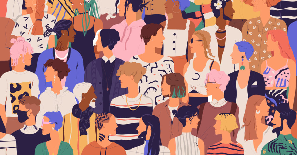
Using Color to Reach Specific Demographics
When choosing which colors to use, it all depends on what you’re selling and which demographics fit your target market. For example, what colors should a toy company use to reach their customers? Children represent an entire demographic. This demographic exhibits the best responses to websites and products using primary colors. Others who used muted blends and pastels didn’t hold their attention.
There is a huge range of variation that must be taken into account. If you’re selling to customers from specific countries and backgrounds, you have to be especially careful with what colors you use. The same color in one culture can mean something quite different in another.
White is considered by many to be a color of peace, tranquility, and simplicity however, to the Chinese, it represents death. You can see how this would complicate things. The French perceive yellow to represent jealousy while Americans associate it with the color green.
Target Market: Different Colors for Different Generations
While culture is one of the most important factors to consider when choosing branding colors, the generation your customers belong to is also significant. Baby Boomers, the segment of the population born between the years of 1943 and 1960 have their own tastes when it comes to color. This generation tends to prefer brand colors that are calming. Such colors include maroon, plum, and pale blue.
Gen X, which represents people born from 1961 to 1980 prefer a pallet of violets and reds.
One of the hottest target markets consists of Millennials which begs the question, what colors do they like? As it turns out, pink has proven to be a favorite among this quirky generation. Keep in mind however, the shade is important. It’s not a hot pink nor is it especially pale. Millennials are flocking to products sporting a warm shade of pink with shades of salmon and peach.
The fact that so many Millennials have embraced this shade of pink which can be seen on cans of LaCroix, Pamplemousse and on products from companies like Glossier, is highly significant. Even more significant is the fact that the same color is attracting Millennials irrespective of gender. This, of course, leads to broader speculation on how conceptions of gender have been changing and how these changes are affecting branding.
If pink isn’t right for your brand, consider these other colors that are favored by Millennials. They generally respond well to bold energetic colors that evoke individuality and creativity. The same rules apply for fonts which is something to keep in mind when making decisions on anything from packaging to brochures.
Why You Need a Color Management Expert
Now that you know more about the importance of color, you need help to get it right. Many firms struggle to achieve high-quality color that is consistent. Maintaining consistency across printed and digital material can be a monumental challenge. That’s where color management experts come in.
They can work with you to help keep your brand colors crisp and consistent. This consistency will help you reach and retain more customers. Brands who are inconsistent with their use of color lose customers. Do the smart thing and get in touch with us today.
In conclusion, color is a powerful thing, and the brands that harness that power effectively don’t just succeed, they excel.