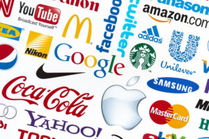
 An iconic brand with good design is more necessary than ever in the modern world. Consider the Apple logo or the Nike “swoosh.” The logo is the foundation of a brand, and its colors can convert or dissuade customers through color psychology.
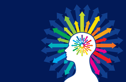
Hues and their various shades conjure up different feelings in your customers and leads. Color plays a vital role in how we perceive a brand. Your brain processes an image 60,000 times more quickly than one text.
Some 90% of data sent to the brain is visual. Color matters the most to your customer, and here’s how customers view your brand through the lens of color psychology.Continue Reading..

 Your star of branding is your logo and its unique hue or colors. That’s right, your branding colors. However, your visual position is the cornerstone of how customers perceive your brand, and they have strong opinions about, well, everything.
 It’s easier to say something by voice search than type it. Texting is dangerous and illegal when on the road, so it makes more sense to speak your question. Moving through the day, for most folks, means multitasking, and voice search gets people the information they need now.
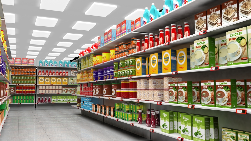
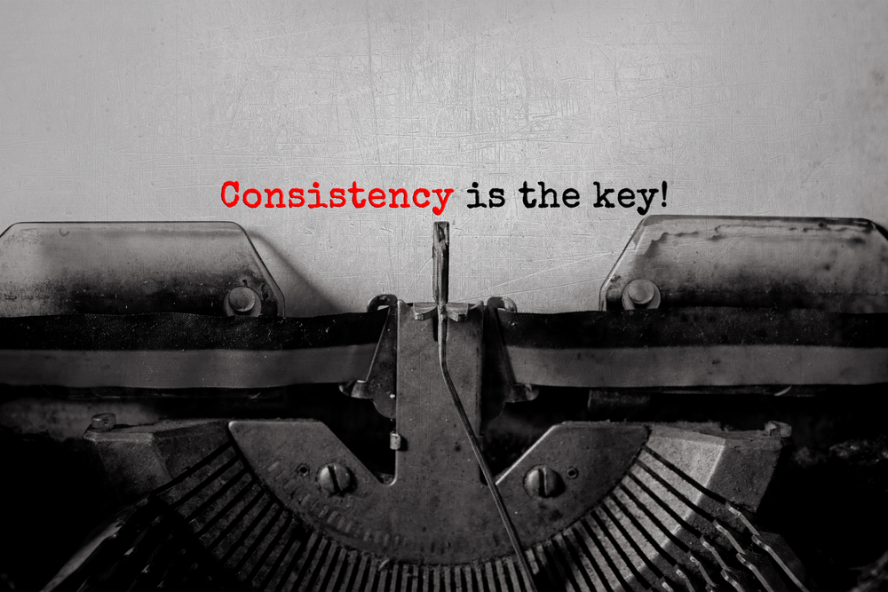 Many companies turn to retro branding to bring out nostalgia and a sense of trust. In 2014, Coca-Cola released Coke Life. A new product with less sugar and more natural ingredients. Also with the classic Coke taste — minus one component, its red branding color. Coke Life came in a green to match its natural transition. Needless say, the product was pulled from many shelves over the next few years.
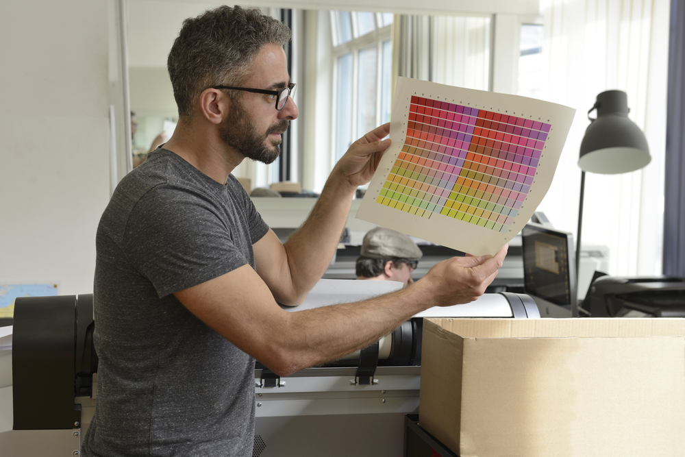 By now, most people know that the best press-ready materials don’t originate from designs in PowerPoint. However, you may still be left scratching your head when you think you’ve done everything right. But the final products don’t match the proofs. Seriously. And: Why?!
 Is sustainable packaging the new enemy of print experts?
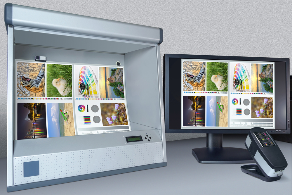 So, is G7 certification what you need?
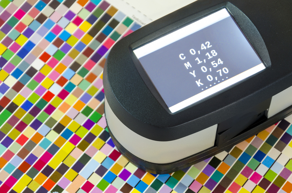 Print quality standards are essential. But how do you maintain consistency from start to finish?