 Marketing is a tough field; Creative Directors and other marketing professionals are judged for every piece of content that they produce. Content quality has a significant impact on sales and influences conversion rates. One of the single most important factors in promotional content is color quality.
The Importance of Color Quality
Creative Directors and marketing professionals know the importance of color quality. Any marring in the quality, clarity, or consistency of printed material is an unacceptable discrepancy that has a tremendous impact on the success of firms around the world.
If the color quality is compromised, customers will be averse to it, and most will choose to buy from a company that can keep their colors straight with crisp, clear imagery.
Remember, the imagery that you use in your marketing campaigns is powerful; at least it should be. To put inferior, blurred, or otherwise imperfect imagery out into the market is to court with disaster, failure. It indicates a certain level of ineptitude that customers don’t respond too positively.
You want your imagery to be clean, clear, and striking. To maintain such high standards in color quality, you will need to have an optimized print environment. The more efficient and precise your printing operations are, the more effective your marketing will be. In addition to color quality, consistency is also paramount.
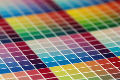
The Drawbacks of Using Similar Tones Side By Side
The quality of print material is more critical than ever. That’s because printed content is used less frequently as digital content continues to rise. That means that printed content needs to be as crisp and impactful as possible to keep it relevant.
You might be tempted to use colors that are similar in side-by-side printing. For the most part, you should try to resist that urge. Although it can be useful at times, many folks run into problems with the color quality. When you print similar colors side-by-side, it becomes harder to tell them apart. More specifically, it makes it difficult to see the distinction between the colors on the page. By blending in and matching each other so closely, it’s easy to perceive them as the same color mistakenly.
Sometimes this discrepancy doesn’t matter or make much of a difference. In situations where you want an overall blend of color or a theme consisting of a mix of similar colors, side-by-side printing won’t be an issue. It becomes an issue when the colors you are using are your brand colors. If your brand logo consists of a few very similar colors, it won’t be distinct. Anything you print side-by-side using brand colors that are too similar will result in something generic and indistinct.
In branding, your use of color must be unique. For example, if your brand colors are red and yellow, you must endeavor to use distinct shades of red and yellow. If you’re not careful, your brand color quality could end up resembling McDonald’s, which could be disastrous, depending on your niche.
The Big Picture
In the end, you want your colors to be unique, distinct, and striking. Even if you use subtle, neutral shades, you want those neutral shades to be unique from each other. Your business is your brand, and your brand is your business. Make it unique, and make sure that you optimize color quality on anything you print.
Business is more competitive than ever before. Although it might not seem like the most important thing in the world, it’s the little things that count. All of those little things add up and have a strong influence on customer decisions. Steer your customers in the right direction towards making a purchase, with superior color quality.