 Companies don’t just pick out brand colors randomly. There is an aim for color consistency.
Typically, there’s a lot of research and thought that goes into selecting fonts, colors, shapes and a great deal more.
This is because consumers come to associate companies with their branding elements, especially their brand colors.
Evernote? Green.
Coca-Cola? Red.
Facebook? Blue.
And the list goes on.
When you look carefully, you can also see that Evernote’s green isn’t any ordinary green. It’s a particular one. That’s how it is with every well-known brand.
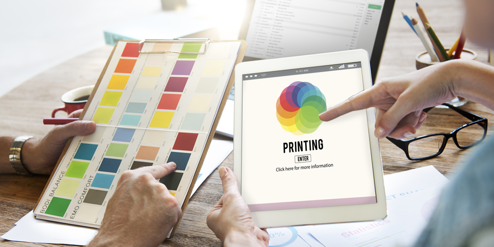
So, maintaining color consistency across different materials is essential but not always as straightforward as it sounds.
Here are five tips for maintaining color consistency on different materials.
1. Keep It Simple
The more colors you use in your designs, the higher the margin of error will be for color consistency.
Two to three colors are generally more than enough to create a memorable brand image.
Just look at Coca-Cola – the colors most associated with the brand are red and white, where white is more of a shade than a color. Arguably, caramel is also a brand color, as that’s the color of their soda.
Nevertheless, the fewer the brand colors you use, the easier it’s going to be to get it right with your print materials.
2. Make a Proof
Don’t go straight from design to printing. When your design is ready, print up a proof.
This can help you spot any problems that you may need to correct with your design before approval, including color accuracy.
If you need to make any last-minute changes at this stage, you still can.
Also, note that in Photoshop you can use the built-in Proof Setup tool to check how your color consistency will look with different printers and paper stock.
3. Use the Appropriate Color Profiles
Regardless of what software you’re using to design your material, you should be able to adjust the color profile to match the desired output.
Colors can come out looking entirely different than expected when you haven’t set the appropriate color settings in your software.
Even web browsers use specific color profiles, so being aware of this can help you better calibrate your designs and images regardless of how they’re going to be used.
4. Use a Color Calibrator to Ensure Color Consistency
Use a tool like the Spyder5 to calibrate your monitors.
By default, your monitors may not be displaying colors accurately or correctly.
Color calibrators are easy to use and typically only take a minute or two to work.
Calibrators ensure that what you see is what you get, so you aren’t thrown off when you’re looking for consistency across your materials.
Also, keep in mind that the quality of monitor you use for designing can make a difference with color consistency, so it’s worth investing in a monitor that has been optimized for design work.
5. Don’t Trust Your Own Eyes
Color can be a hard thing to judge, so having a second and even third opinion can be valuable during this process.
If you haven’t had your eyes checked recently, do so. It’s also important to recognize that one eye is typically more sensitive to certain colors than the other.
As well, if you need glasses, be sure to wear them while designing. It’s hard to be the best judge of color when you can’t see properly.
If you’re working with other designers, it should be easy to get them to proof and critique your work.
Achieving Color Consistency
It’s important to understand that it’s impossible to achieve 100% color consistency across all your materials.
What appears on a screen isn’t always going to be the same as what appears on a business card, pamphlet, postcard or otherwise.
But if you go through the right steps, your materials should maintain a consistent look, which helps you stay top of mind with your target audience.
How do you maintain color consistency with your materials?
Let us know in the comments below.