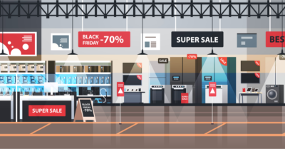
 Did you know that color influences more than 60% of a person’s assessment of a product? This can go up to 90% of their evaluation about a product or a store in some people. Color is universal, and its impact on purchase decisions is undeniable. But how does color quality affect in-store advertising?
In-store advertising is effective because it is targeted at people who are highly engaged. They are likely to be already familiar with the brand. This marketing channel has evolved through the years. In the past, it used to be static signs spread throughout the store. There are digital wait-boards, digital menu boards, video walls, kiosks, and way-finding screens. Brands now can send more interactive messaging than ever before. But what role does color play in all of this?
The Psychology of Color in Marketing
The choice of colors within any store is meant to evoke certain customers’ feelings to be more likely to spend. Research around this area shows that arousal and pleasantness are some of the most significant factors determining customer spend. As such, the choice of colors and the store’s overall arrangement should arouse the customers’ senses. Also, the customer should feel relaxed and well-pleased during the time they spend in the store.
Once customers are in the store, the in-store advertising should be subtle but powerful as well. The reason for advertising should be clear as well. Is the company trying to sell a new product? Is it trying to increase brand recognition? Is it new packaging? In-store advertising provides opportunities even to cross-sell related products and services.
Examples of Color Usage in In-Store Advertising
Take, for instance, customers who are waiting in a bank. The bank has just introduced a new savings account that offers attractive interest rates above what competitors are offering? The bank will want to evoke feelings of trust but also excitement in the customers’ minds. Therefore, the bank might have brochures printed in high-quality paper with a lot of blue on them. Blue evokes a feeling of trust and tranquillity, and most conservative brands will have blue on their logos.
In contrast, there are stores where brands try to evoke feelings of excitement to promote impulse buying. Fast food restaurants, for instance, use a lot of red colors. Red color springs feelings of emergency and tends to trigger hunger. Such branding for store advertising coupled with the aroma of the food drives consumer spending upwards.
A color such as white conveys a perception of cleanliness. A lot of brands will use white walls for this reason. It acts as a canvas to then layout how you want your store to look and feel. Green, on the other hand, symbolizes nature and evokes feelings of relaxation. A brand such as Starbucks used green to send a subtle message that their coffee will help relieve the pressures of a long day of work.
Color alone is not enough.
Brands must be careful about how they opt to use different combinations of colors with any store advertising. The color must be supported with other forms of messaging to convey a wholesome message. For instance, Nike uses a combination of black and white. As a sports apparel company, Nike’s choice of colors conveys authority, reliability, and strength. Chanel, on the other hand, uses black to convey elegance, mystery, and timelessness.
The difference in perception of two brands using the same colors comes from the nature of the products they sell, the brand ambassadors they use, the nature of ads they show, and so much more. Color is only one angle to it.
If your company is unsure about the choice of colors for your brand, it may be advisable to work with a professional color management company. They will help bring out your intended brand image with the right choice and quality of colors for your in-store advertising campaigns. Check out our website for more information on color management.
